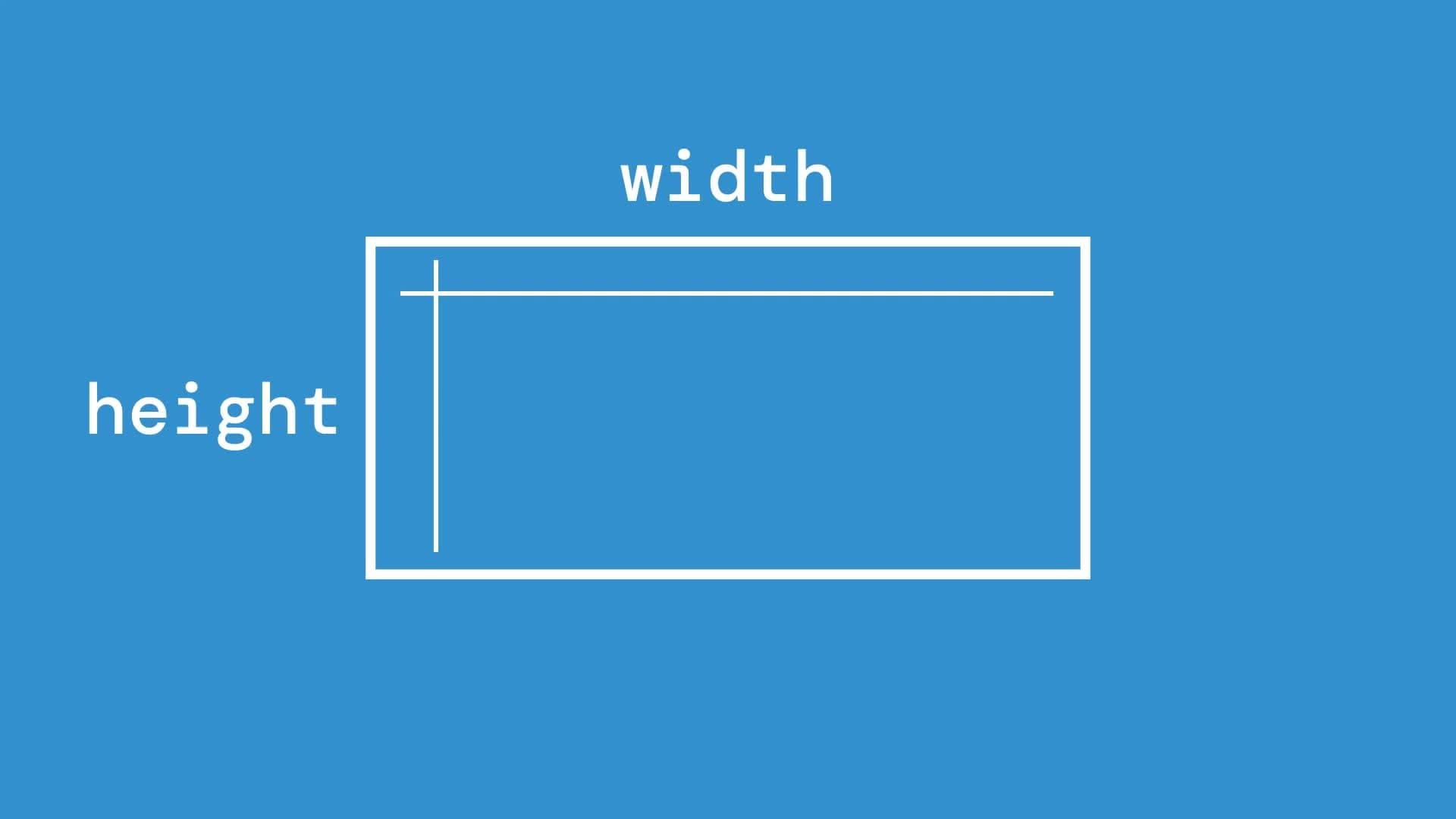
If you've ever set vertical padding or margin as a percentage in CSS, you might have noticed something peculiar: percentages on padding-top, padding-bottom, margin-top, and margin-bottom aren’t calculated based on the height of the containing element. Instead, they’re calculated based on its width!
This behavior can lead to some unexpected results, especially when adjusting browser window width. For example, as the width of a parent container changes, you may notice that the vertical padding or margin on its child elements changes too.
In this post, we'll break down this behavior, understand why it’s not a bug, and explore the reasoning behind this CSS specification choice.
Scenario: Vertical Padding Changes with Width
Consider the following HTML and CSS code:
<html>
<head>
  <meta charset="utf-8" />
  <title>Padding Percentage Example</title>
  <style>
    .container {
      width: 100%;
      height: 400px;
      background: pink;
    }

    .inner {
      background-color: yellow;
      width: 300px;
      height: 200px;
      padding-top: 10%;
    }
  </style>
</head>

<body>
  <div class="container">
    <h2>.container</h2>
    <div>width: 100%</div>
    <div>height: 400px</div>
    <div class="inner">
      <h3>.inner</h3>
      <div>width: 300px</div>
      <div>height: 200px</div>
      <div style="color: red">padding-top: 10%</div>
    </div>
  </div>
</body>

</html>
In this example, .inner has padding-top set to 10%. However, rather than being calculated based on the height of the container, this 10% padding is based on the container's width. So, as the width of the browser window changes, the padding-top on .inner adjusts dynamically, affecting the height of the yellow box.
<video controls muted src="//videos.ctfassets.net/ebjeal0s7913/1cINSFL9vTtCJAw6Po7NgX/81c41ce790db468d02a4d7da7dc1e613/width-height-percentage.webm" style="max-height:640px; min-height: 200px"></video>
Is This a Bug?
No, this behavior is not a bug. The CSS specification intentionally defines percentage-based padding and margin values as relative to the width of the containing block.
As outlined in the W3C specification for padding properties:
Percentages: refer to width of containing block.
The same rule applies to the CSS margin properties.
Why Does the W3C Specification Follow This Approach?
The reasoning behind this CSS design decision may not be immediately obvious, but it becomes clearer when we consider the complexities of layout mechanics in CSS. As Ryan Kinal discusses on Stack Overflow, calculating padding or margin percentages based on the container's width helps avoid potential layout problems, including circular dependencies.
1. Avoiding Circular Layout Dependencies
Imagine if padding-top or padding-bottom was calculated based on the parent’s height instead of its width. In CSS, the height of a container element is often determined by the cumulative height of its children. If a child’s height depends on the parent’s height (via percentage padding), and the parent’s height depends on the child’s height, this can lead to a loop that the browser cannot resolve—potentially resulting in either an inaccurate layout or an infinite calculation loop.
2. Simplifying the Layout Engine
Calculating percentage-based padding and margins relative to the width simplifies how browsers render elements. Width-based calculations provide a single reference point, making it easier for the browser to compute the layout without needing to constantly recalculate based on both width and height. This consistency keeps CSS layouts more predictable and helps prevent complex cascading issues in layout recalculations.
Practical Implications for Responsive Design
Understanding this behavior can help you avoid surprises, especially when building responsive layouts. Here are a few practical tips for working with percentage-based padding and margins:
-
Plan Vertical Spacing with Width in Mind: When using percentage-based padding or margin for vertical spacing, remember that these values will respond to changes in the width of the parent container, not its height. This makes them useful for maintaining consistent vertical spacing as the layout scales horizontally.
-
Consider
vhandvwUnits for Consistent Scaling: If you need padding or margin to be tied to the viewport's height or width specifically, CSSvh(viewport height) andvw(viewport width) units may be more appropriate. These units allow you to achieve responsive spacing without relying on the container’s dimensions. -
Use Flexbox or Grid for Complex Layouts: If you need more control over vertical spacing relative to the parent’s height, Flexbox and Grid layouts provide additional options, such as aligning items based on available space, without needing to use percentage padding or margin.
Conclusion
While it might initially seem strange, CSS’s decision to calculate vertical padding and margins as a percentage of width rather than height is intentional. This design choice avoids potential issues with circular dependencies and infinite loops, creating a more consistent and predictable layout engine. By understanding this rule, you can work more effectively with percentage-based padding and margin in your responsive designs.
Understanding the why behind these specifications helps us use CSS more effectively, especially when tackling responsive layouts that look and feel right across devices.